Table of Contents
Visualizing Stuff
More Tufte
Excellent case study is the space shuttle challenger. space_shuttle_challenger.zip
- On multi-variate problems, it's easy to get confused/lost in the data unless you simplify it to 2D.
- The congress investigation committee still didn't get it and made confusing infographics that looked kinda cool but weren't clear.
- Even Feynmann in his “scientific” explanation didn't acknowledge the limitation of his experiment. (no water touched the ring in rocket even though it did in his glass, might've caused more hardening, etc)
Cinematography
Things are interesting when they are slower/faster or bigger/smaller than normal. Why does it attract our vision so much? Maybe it's that there might be new information there that we haven't seen before?
Koyaanisqasi On Hulu (stopped with 32:10 to go) and Chronos (HD, free on youtube?). Maybe others by
YouTube Link! https://www.youtube.com/watch?v=iqUBmeFn7qM
Several more recommendations for Tufte's Visual Display of Quanititative Information. I liked this one for statistical stuff here, as well as visualizing least-squares stuff (SAS JMP) here.
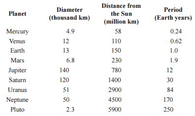
Planet Visualization
Original
Very poor. Units are inconsistent and add lots of eye strain.
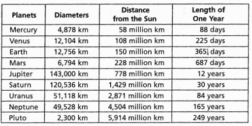
Way better
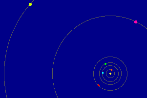
GIF illustrates the motion and data is aligned correctly and maximally visualizes the relationships. Uses Latex package for aligning by decimal placeA better plot would combine the motion and the data in the same plot I think…
 and
and